On Using Flags to Represent Languages 🇯🇵 🇬🇧 🇫🇷

(This was an internal whitepaper for Chatterbug that I wrote when we were debating the use of flags as an iconic representation of languages in our app)
Many websites and other user interfaces over the years, both online and offline, have faced a very interesting usability challenge concerning how to represent spoken languages with iconography.
From websites to flight attendants to tour guides, what is a good way to communicate a language quickly, unambiguously and language agnostic?
What’s Awesome About Flags
It’s interesting in that it is in many cases actually much easier than normal iconography problems in that with flags there exists an internationally and language-agnostic icon that in many, many cases shares a word and connotation with a single spoken language.
In normal iconography, like for computer user interfaces, designers have to figure out which image would best mean “home” or “back” to people of different cultures and this can be difficult.
Homes can look different in different places, time can move in different directions culturally, etc.

Also, if you put clarifying text under or next to an icon, you have to choose a language, where with flags, they’re the same flags in every language. For example, China doesn’t have a different flag in France than it does in the United States, even though the country itself has different names in these places.
In the cases where there exists a country that shares the same word in most cultures with the language we’re targeting (ie: “England” for “English”, “Spain” for “Spanish”, etc), you can only use the icon and can avoid the issue of having to know beforehand what language the user speaks. It’s completely universal and unambiguous in a way that almost no other iconography can be.
Flags are also highly recognizable and in many cases, totally unambiguous. If you want to represent Italian as a single image, the flag of Italy would be instantly and unambiguously recognizable to over 80% of people who see it (according to survey data from Sporacle from 3M people who took a “flags of the world” quiz).
What’s Not Awesome About Flags
So, this sounds great. For all four languages we offer, we have a single image we can use to immediately and unambiguously bring to mind the name of the language we’re trying to represent and is recognizable by more than 80% of everyone who sees the image, regardless of their cultural background or natively spoken language. This is almost unprecedented in UX design, it’s an amazing miracle.
However, there are still issues, because flags specifically represent countries, not languages. Not all countries officially speak only one language and many languages are spoken officially by multiple countries.
This introduces three major problems.
The first is that for languages that are spoken over wide geographical areas, especially across country borders, there are major linguistic differences that split the language into dialects while often not technically dividing the language into distinct language families. This means that the French spoken in Quebec and France may be different in significant ways, though they are both still called “French”. To use the flag of France can infer a specific “France the country” dialect of French, which may not be what the user speaks or wants to learn.
The second major problem are potential political issues that become inferred with the usage of a specific flag, especially since many languages are spoken in multiple countries due to colonialism or historical war or conquest.
There are many examples of this, but let’s take the least politically sensitive of all of them, the case of me as an American having to click on the British flag because of its association with England and thus “English”. The language of my country’s historical colonial oppressors. (Queue me dumping my proverbial tea into the metaphorical harbor. Take that, you bloody Torries!) But seriously, for countries with heavy political issues, this can be an uncomfortable and unfortunate association to be constantly reminded of when using a product.
The third problem is that some languages do not have the unambiguous namesake country that all of the languages we currently offer have. Swahili or Arabic, for example, are not named after modern countries and so do not enjoy the reverse reference that we take advantage of for French or Spanish, which have one clear namesake country and vice-versa.
Why Use an Icon At All
Well, maybe the way out of this conundrum is to simply not use icons. We can use words or ISO codes like ‘fr’ or ‘en’. Something that specifically stands for the language itself. Forget icons.
Well, in this case we have two options.
We can choose the word in the language we’re trying to represent, so “Deutsch” as opposed to “German”, or “日本語” or “Nihongo” instead of “Japanese”. This has the rather large downside of people new to the language not being able to understand how to find or identify it. For instance, to choose it to start studying. Quick, what language is “Svensk”? Or “українська”? Well, now if you wanted to learn Swedish or Ukranian, you’re screwed.
Using ISO language codes is even worse, because it’s in the target language and it’s abbreviated. Now you need to know how it’s said in the language and how it’s shortened. Quick, what is “Chinese” in two-letter ISO codes? It’s “zh” for 中文 (Zhōngwén). OK, what’s Japanese, knowing from the last paragraph that in Japanese, the language is pronounced にほんご (Nihongo). Ooops, turns out you’re wrong, it’s not “ni”. It’s actually “jp”, the random shortening of the English way to say the language, because hilariously, standards aren’t standardized.
If you’re choosing the language you speak from a list of languages, then fine, we can use the native target language (Although then alphabetizing becomes interesting — is 日本語 under “J” or under “N”?) Otherwise, the target language is often a poor choice for a menu. The ISO code is almost always an even worse choice.
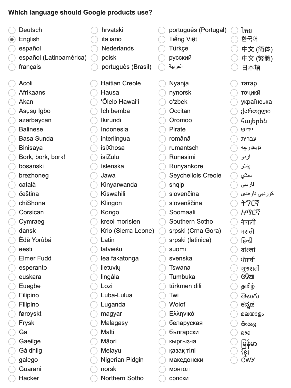
OK, so then how about we use the name of the target language in the language that the user speaks. So instead of “Deutsch”, we use “German” for English speakers and “Allemand” for French speakers, etc.
The problem here becomes when the website or UX does not know what language the user speaks. Now you actually need two different inputs, one that indicates which language we think you speak, and another dynamic one that is built from the first choice. Of course, in the case of dynamic websites, this is possible. In the case of printed name tags or mixed audiences, this is not an option.
Often online this can be helped with the set browser language, but even then it’s problematic.
Let’s say someone has their browser set to Polish and we don’t have the names of everything in Polish. Maybe they also speak German or English or Russian or whatever, but there is no way for us to know that. Some websites don’t even try to guess and just set the language to a default for where geographically you’re hitting the site from, which is horrible if you’re travelling. Because now you have to figure out what part of the site says “What is your language”.
I will tell you know, if you don’t speak German, you will never be able to guess that “Ausgangssprache” means “The language you’re coming from”, nor will you be able to tell that “Deutsch” means “German”. Because nobody in the world uses “Deutsch” to mean German except Germans. This means you can’t even identify which part of the website you’re looking at could be involved in switching your language.
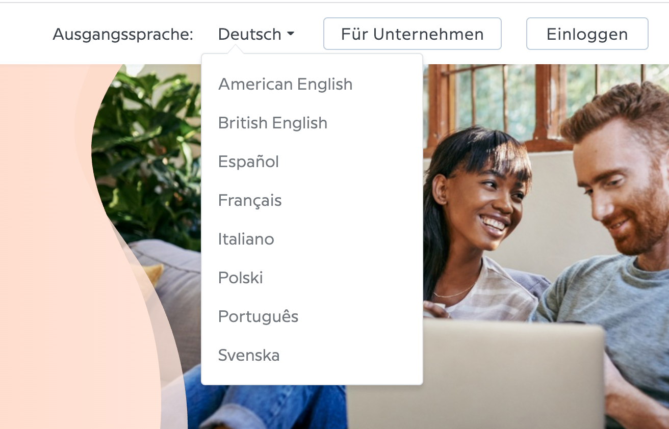
However, even if we don’t recognize the words, flags make this not only pretty easy to identify what language they’re talking about, but that they’re talking about languages at all.
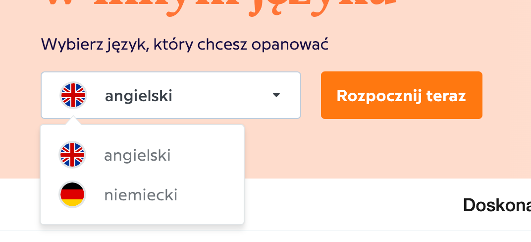
This is the other side benefit of using flags, if you see nothing else on the page that you can recognize, the flag is a flag and that gives you information that this is where language (or perhaps country, but that also indicates language in these contexts) is handled in some way.
This is true in other contexts as well. For example, if I see a flight attendant with two flags on their badge, and one of them is not the German flag, I can be pretty sure that this person doesn’t speak German, because I immediately know this means “languages” and I don’t see the German one. But if it lists out “日本語, Svensk”, I am essentially given zero information unless I happen to know one of those languages.
OK, So How About NEWER BETTER Icons for Languages?
I mean, the ideal would obviously be that we have some iconic symbol for each language itself that is independent of a single country, or countries at all. To some degree, we actually have this with the Arab League, where there exists a flag that represents 22 Arab speaking countries in the world and is generally recognizable as it draws from the flag designs and colors of several of its member countries. However, we don’t have this for any other language I can think of.
We could perhaps make up a new set, which would be beautiful I’m sure, but there is no point to that because then we would have to educate several billion people around the world what all of these new icons look like, which international events and travelling and people using flags to represent languages for decades has already done with this flag-based set.
Everyone constantly sees flags on the badges of people giving tours of a city, or working on an airplane, or next to names during an olympic event. People have already been trained in what language dozens of flags represent and can recognize them immediately and from a distance. They convey information very powerfully and very quickly.
What About Other Images?
The problem with other images to represent languages is that they essentially have to be stereotypical for a large percentage of people to draw the correct association. Having a sombrero or Eiffel tower or something is both still heavily country-specific and now goes even further into stereotyping that has similar issues to flags.
So, What Will We Do?
I think that Chatterbug should do what’s best for the customer. As different strategies are effective in different situations, our design language should respond to what is best for the customer in each situation.
If you see a flag on flight attendant’s badge, you can tell, from halfway down the airplane, exactly what languages they speak. Think of how difficult that would be to accomplish with any of the other methods listed here and how much more quickly, unambiguously and far-away this is accomplished with a couple of small flag icons than with any other method. This speaks to the flags usability power as an icon — compact, fast to recognize, no need to translate and visually pleasing.
In situations that require these attributes, we should always use the flag iconography.
If we know the user’s language, we know the name of the languages in that student’s language, and there is not the possibility of a mixed audience, then we should use the full name of the language in the student’s language (ie “German”), next to the flag icon.
If we do not know the user’s language, we should use the names of the languages in English (as they are probably the most universally recognized). Again, along with flag iconography as it can be helpful to disambiguate that we’re speaking about languages.
In the special case that we’re specifically asking the user to identify for us the language they speak, we should use the native language (“Deutsch”, “日本語”, “Svensk”) with no flag.
Ok, But Which Flags?
Of course, should we decide that flag iconography is helpful and should be used, which flag do we choose to represent a language? It should not be subjective and there should be a single one consistently used to represent each distinct language we teach.
I propose that the criteria be the country or flag most commonly associated with the origin or name of the language. This will cover most languages I can think of for quite some time. It also avoids difficult things like “country with the most speakers” or “where people want to travel to speak this” or other more confusing or highly subjective criteria. This will still become problematic if we get into teaching both Urdu and Punjabi (do we use the Pakistani flag for both?), but that’s actually probably fine (to use the same flag for a few languages) and not a problem we’ll hit for quite some time most likely.
In reality, I think it’s very easy to basically ask anyone what the most commonly associated flag for almost any language is and get the same honest answer from basically everyone.